Cycle time report
See how long a team typically takes to complete work.
Every team has a Cycle time report to visualize the average cycle times of stories and bugs. You can adjust the timeframe, filter by item type (stories or bugs), and refine the data by story size.
Understanding time zones in the Cycle time reportCycle time data is grouped based on the team’s time zone. This ensures that dates and trends in the report align with how the team works and plans. When you click a bar to view specific items, results on the Everything page reflect the same team time zone.
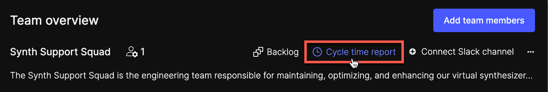
Access the Cycle time report
On the Team overview page, click Cycle time report.
Interpret cycle time graphs
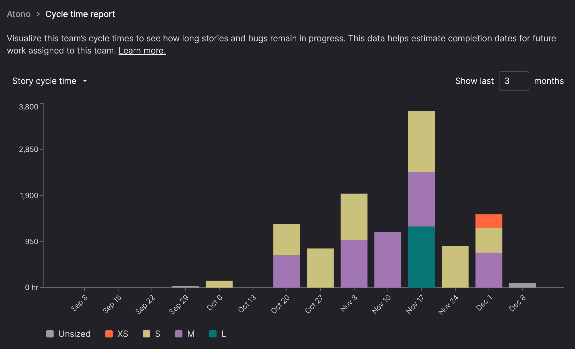
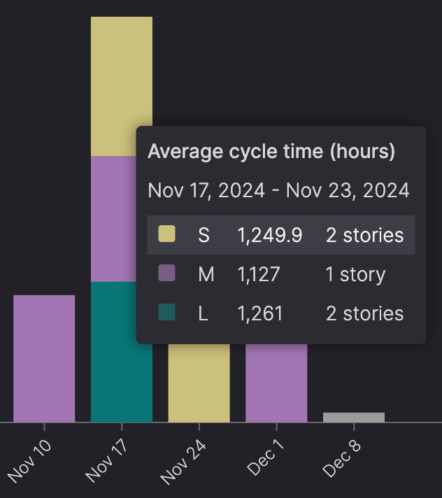
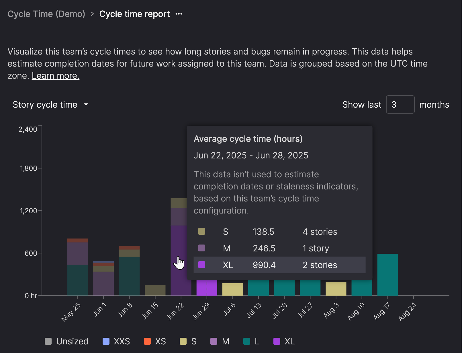
The Cycle time report graphs display the average cycle time for stories or bugs that transitioned into the 'Done' category during a selected time period.
When you open the report, it defaults to showing Story cycle time for the last 3 months, with each bar representing 1 week.
What you can do:
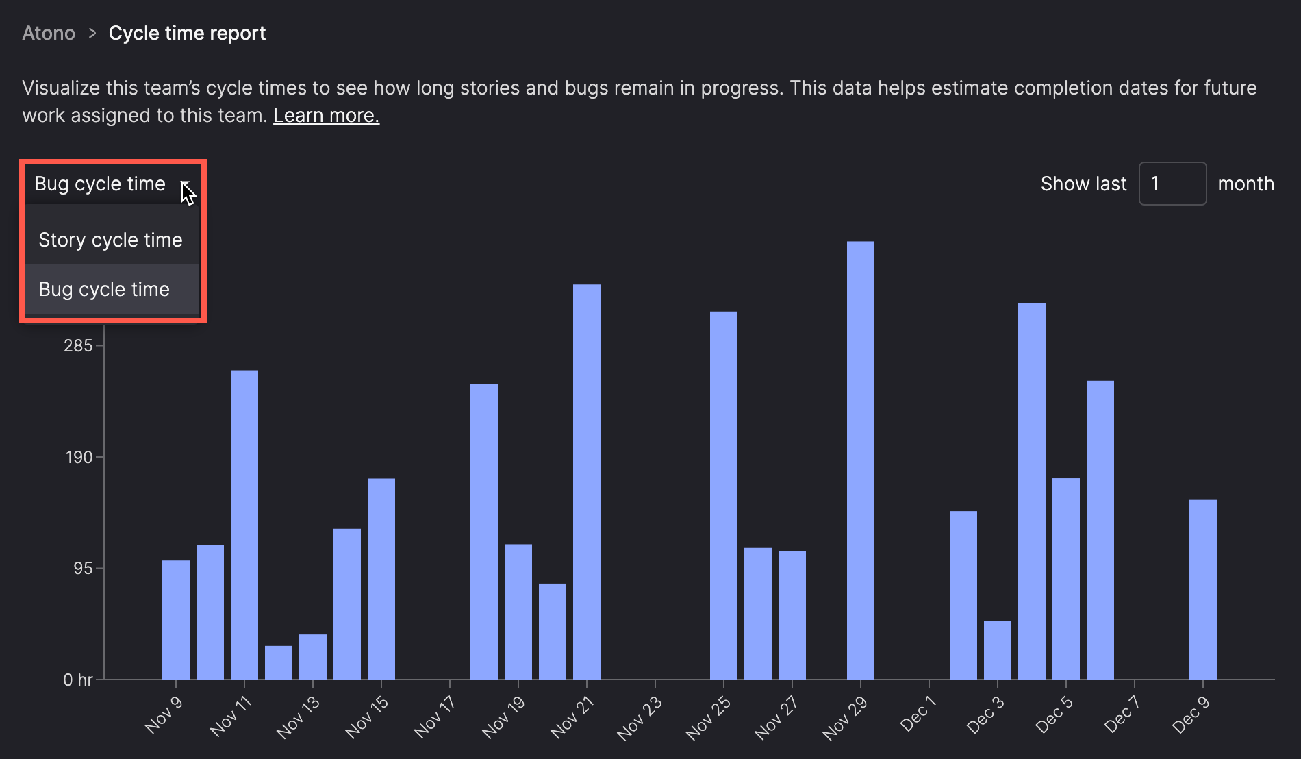
- Switch between Story cycle time and Bug cycle time.
- Change the timeframe of the graph to adjust the resolution.
- Hover over bars in the graph for detailed information.
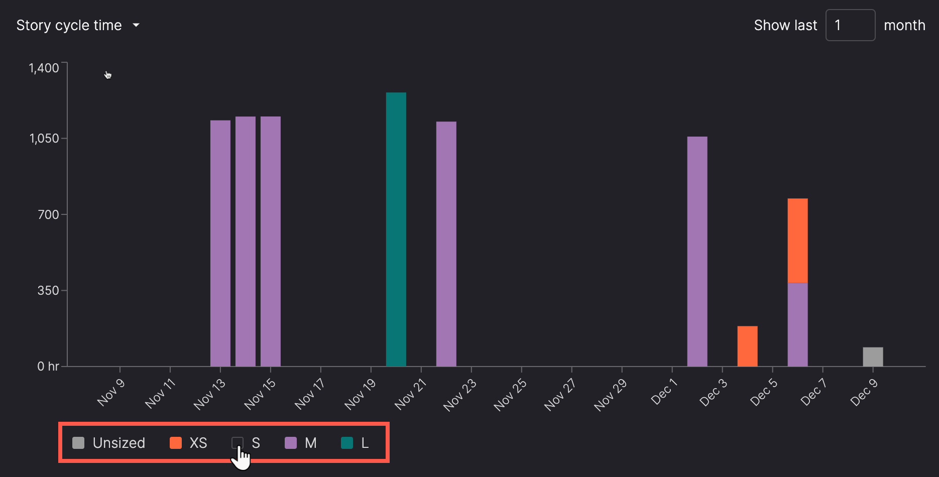
- Filter the Story cycle time graph by story size.
Change the graph
Use the selector above the graph to select one of the following:
- Story cycle time
- Bug cycle time
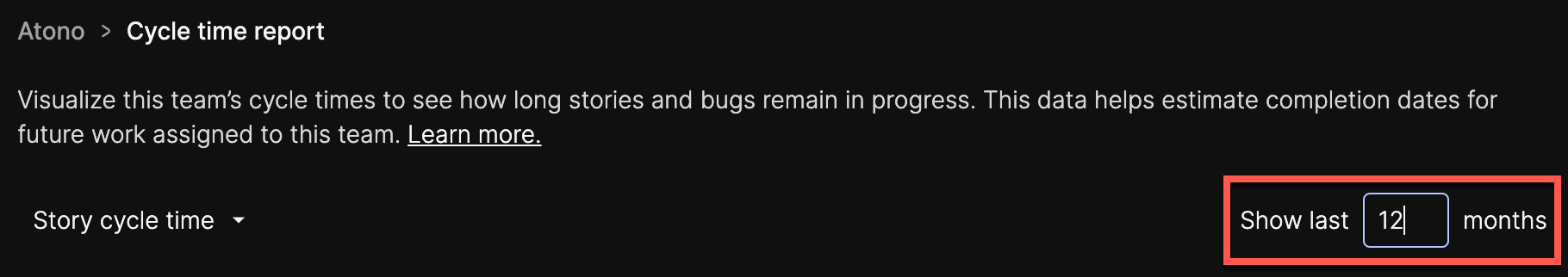
Change the timeframe
Use the timeframe selector at the top of the graph to show data for the last 1 to 60 months. Adjust the number in the selector to update the view.
The graph resolution adapts automatically to the specified timeframe, displaying data at different levels of detail:
- 1 month: Bars represent daily averages.
- 2-7 months: Bars represent weekly averages.
- 8-31 months: Bars represent monthly averages.
- 32-60 months: Bars represent quarterly averages.
Filter by story size
Use the filters below the Story cycle time graph to include or exclude data for specific story sizes. Unsized stories are grouped in their own category.
View data details
Hover over a bar in the graph to see a pop-up with details about the number of items moved into the 'Done' category during that period and their average cycle times. Use this information to spot patterns, such as high-activity days or extended cycle times, and identify opportunities to improve your workflow.
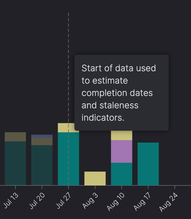
Understand visual indicators for calculation range
If your team has configured a custom averaging window—either a rolling number of months or a specific start date—the graph updates to reflect what’s used in cycle time calculations.
The following visual cues help you understand which data is actively shaping projections—and which parts of the timeline are just there for context.
Greyed-out bars
Bars outside the configured calculation range appear dimmed. These are shown for reference, but aren’t included in estimated completion dates or staleness indicators.
Dashed vertical lines
Dashed lines mark the start and end of the data being used for cycle time calculation.
Configure the cycle time averaging window
You can configure how Atono calculates average cycle time for each team. This affects estimated completion dates and staleness indicators.
Only Workspace Owners, Workspace Administrators, Backlog Owners, and Team Administrators can change this setting for a team.
- Click the ellipsis (...) icon next to the title of the Cycle time report and select Cycle time configuration.
- Choose one of the following three options:
- Default: Includes items completed in the past 6 months (or as far back as the records go, if shorter)
- Recent months: Includes items completed in a rolling window based on the selected number of recent months (1 to 12).
- From selected date: Includes items completed on or after the selected date.
- Click Save.