Engagement
See which features are getting the most use across your product.
The Engagement page shows a graph of your top features, ranked by real usage. It builds on Feature engagement by moving beyond individual stories to reveal adoption trends across all tracked features. As you apply filters—by product theme, team, environment, completed date, customer, or location—the graph updates dynamically to highlight up to 10 features within that slice of data.
For product managers, this makes it easier to see which features are resonating with users, follow adoption trends over time, and identify areas that may need more attention.
To see data here, usage tracking must already be set up for the stories behind your features. This requires the Atono SDK. After installing it, you can capture usage either through your app’s code or by mapping clicks to stories with the [Atono Chrome extension].
Access Engagement
In the side menu, click Engagement.
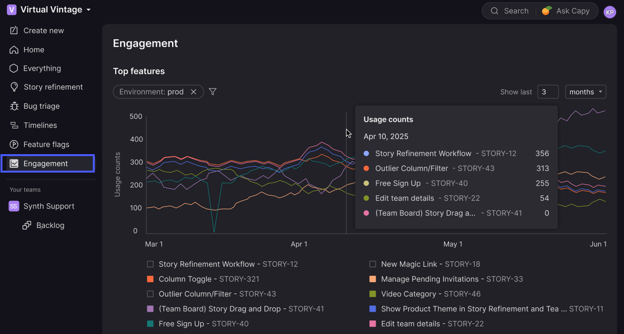
Understand the Top features graph
The Top features graph shows how often users interact with different features over time. Each line represents a different story (or feature), so you can compare usage patterns over time.
When you first open the graph, it defaults to showing usage over the last 3 months for the last environment listed on the Environments page.
The Engagement graph remembers your selected timeframe and filters. When you return to the page, it loads in the same state you last used. Settings are saved per user and don’t affect anyone else.
View usage details
Hover over the graph to see usage counts for a point in time or date range.
A vertical line will appear to highlight the selected period, along with a breakdown of usage counts by feature.
Adjust the timeframe
Use the dropdown above the graph to show data for any period between 1 and 60 months. The graph’s resolution adjusts automatically based on the selected range:
- For timeframes under 1 year, the graph shows daily usage counts
- For timeframes over 1 year, the graph shows weekly usage counts
To keep the graph easy to read, Atono limits the total number of data points (up to ~400).
Show or hide features in the legend
The legend below the graph lists the top 10 features currently displayed. Use the checkboxes to show or hide specific features so you can focus on the ones you want to compare.
This only changes visibility on the graph—it doesn’t affect which features are included in the top 10 list.
Apply filters
Use the filters at the top of the graph to decide which features are included in the top 10 list. You can filter by product theme, completion date, team, environment, customer, or location. As you apply filters, the graph recalculates to show only the top features that match.
For example, you might filter to a specific team’s backlog, then use the legend below the graph to show or hide individual features within that filtered set.
- Click Filter by at the top of the graph.
- Select one of the available filters and fill in any required details.
- Click Done.
- Repeat steps 1-3 to add additional filters as needed.
The graph updates to display only features matching all active filters. Active filters appear at the top of the graph so you can see what’s applied.
How filters work
For multi-select filters, items matching any of the selected values are included. For example, if you select more than one team, the graph includes features assigned to either team.
Features that don’t match the filter criteria are removed from the dataset before the top 10 is recalculated.
Available filters
| Filter | Description |
|---|---|
| Product theme | Show features within selected product themes, or 'No theme'. |
| Completed* | Set a date and time range for when the feature was completed (when the story moved into a workflow step in the 'Done' category). |
| Team | Show features assigned to one of the selected Team backlogs, or 'No backlog'. |
| Environment | Show usage within selected environments. |
| Customer | Show usage by one or more customers. For more details, see Filter by customer. |
| Location | Show usage by one or more locations. For more details, see Filter by location. |
*When using the Completed filter, you can specify absolute or relative date ranges and include the time of day to narrow your search further. For details, see Filtering by date and time.